seaborn
5.3. seaborn#
We will end our very broad discussion of data visualization with seaborn. seaborn is based on matplotlib, but us “higher-level” (i.e. easier to use) and makes what many consider nicer looking graphs (i.e. many = me). So, why didn’t we start with seaborn? I think it is good to see matplotlib, since it is the most popular way to create figures in Python. But, you should take a look at seaborn as well.
seaborn comes with Anaconda, so there’s nothing to install here. Just add import seaborn as sns to your set-up and you’re ready to go. In my set-up, I’ll set a theme, so that the same theme is used across all of my graphs. I’ll create my returns directly in the stocks DataFrame.
DataCamp has a seaborn tutorial as well.
There’s an example gallery as well.
You can find other examples here.
Finally, I’m going to use the df.var_name convention for pulling out variables from a DataFrame. I find it easier than df['var_name']. I’ll go back and forth in the notes, to get you use to the different styles.
# Set-up
import numpy as np
import pandas as pd
import seaborn as sns
import matplotlib.pyplot as plt
sns.set_theme(style="white")

# Include this to have plots show up in your Jupyter notebook.
%matplotlib inline

# Read in some eod prices
stocks = pd.read_csv('https://raw.githubusercontent.com/aaiken1/fin-data-analysis-python/main/data/tr_eikon_eod_data.csv',
                  index_col=0, parse_dates=True)

stocks.dropna(inplace=True)

from janitor import clean_names

stocks = clean_names(stocks)

stocks['aapl_ret'] = np.log(stocks.aapl_o / stocks.aapl_o.shift(1))
stocks['msft_ret'] = np.log(stocks.msft_o / stocks.msft_o.shift(1))

stocks.info()
<class 'pandas.core.frame.DataFrame'>
DatetimeIndex: 2138 entries, 2010-01-04 to 2018-06-29
Data columns (total 14 columns):
 #   Column    Non-Null Count  Dtype
---  ------    --------------  -----
 0   aapl_o    2138 non-null   float64
 1   msft_o    2138 non-null   float64
 2   intc_o    2138 non-null   float64
 3   amzn_o    2138 non-null   float64
 4   gs_n      2138 non-null   float64
 5   spy       2138 non-null   float64
 6   _spx      2138 non-null   float64
 7   _vix      2138 non-null   float64
 8   eur=      2138 non-null   float64
 9   xau=      2138 non-null   float64
 10  gdx       2138 non-null   float64
 11  gld       2138 non-null   float64
 12  aapl_ret  2137 non-null   float64
 13  msft_ret  2137 non-null   float64
dtypes: float64(14)
memory usage: 250.5 KB
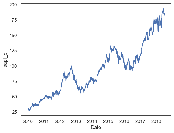
Let’s start with our line plot again. We’ll plot just AAPL to start.
sns.lineplot(x=stocks.index, y=stocks.aapl_o)
plt.show();
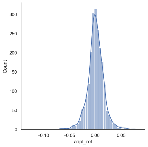
We can also make a distribution, or histogram, as well. I’ll add what’s called the kernel density estimate (kde), which gives the distribution. We’ll do more data work like this when thinking about risk.
sns.displot(stocks.aapl_ret, kde=True, bins=50)
plt.show();
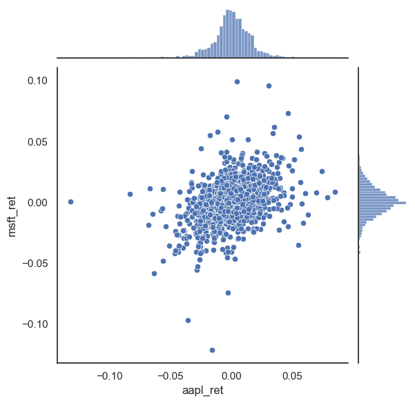
sns.jointplot(x=stocks.aapl_ret, y=stocks.msft_ret)
plt.show();
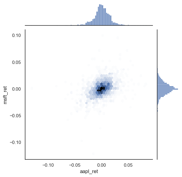
sns.jointplot(x=stocks.aapl_ret, y=stocks.msft_ret, kind='hex')
plt.show();